

The crypto market moves fast, but most people are still reacting to the wrong signals.
Headlines, influencer predictions, and narrative-driven hype dominate the conversation — yet price alone rarely tells the full story. If you want to understand what the crypto market is actually doing right now, you need to look underneath the surface.
The good news? You don’t need dozens of indicators or advanced trading software.
There are three core charts that explain nearly everything happening in crypto today:
- Where capital is flowing
- How much risk investors are taking
- Whether demand is real or speculative
Master these three, and you’ll have more clarity than 90% of market participants.
Chart #1: Bitcoin Dominance — Where Risk Is (and Isn’t)


What Is Bitcoin Dominance?
Bitcoin dominance (often shown as BTC.D) measures Bitcoin’s market capitalization as a percentage of the total crypto market cap.
In simple terms, it answers one critical question:
Is money flowing into Bitcoin, or spreading into altcoins?
This single chart captures risk appetite across the entire crypto ecosystem.
How to Read Bitcoin Dominance
- Rising dominance
→ Capital is consolidating into Bitcoin
→ Investors are prioritizing safety and liquidity
→ Altcoins usually underperform - Falling dominance
→ Capital is rotating into altcoins
→ Risk appetite is increasing
→ “Altseason” conditions begin to form
This is why Bitcoin dominance often rises during:
- Bear markets
- Macro uncertainty
- Liquidity contractions
And falls during:
- Bull markets
- Excess liquidity
- Retail-driven speculation
Why Bitcoin Dominance Matters Right Now
At the moment, Bitcoin dominance remains elevated relative to historical bull market peaks. That tells us something important:
The market is still cautious.
Despite excitement around new narratives — AI tokens, restaking, meme coins — the majority of capital continues to seek refuge in Bitcoin.
This doesn’t mean altcoins are “dead.”
It means the market hasn’t fully shifted into broad risk-on mode yet.
If you’re wondering why many altcoins struggle to hold gains, Bitcoin dominance explains it better than any influencer ever could.
Chart #2: Stablecoin Supply — Dry Powder and Market Intent
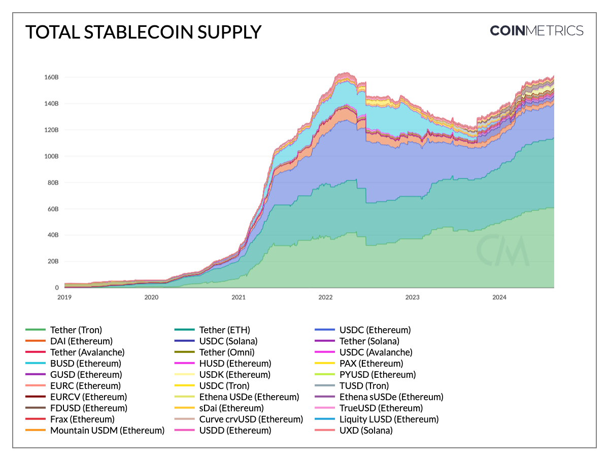
Why Stablecoins Matter More Than Price
Stablecoins are often overlooked, but they represent one of the most important forms of on-chain liquidity.
Unlike fiat sitting in a bank, stablecoins:
- Are already on-chain
- Can be deployed instantly
- Reflect intent, not speculation
That’s why tracking stablecoin supply is so powerful.
How to Read Stablecoin Supply
- Rising stablecoin supply
- Capital is entering crypto
- Investors are waiting for opportunities
- Indicates potential future buying pressure
- Falling stablecoin supply
- Capital is being deployed into assets
- Risk appetite is active
- Often coincides with market rallies
This chart helps answer a critical question:
Is money entering the crypto ecosystem, or leaving it?
What Stablecoin Supply Is Signaling Now
Currently, stablecoin supply has stabilized after prior contractions. This suggests:
- Capital hasn’t fully exited crypto
- Investors are cautious but positioned
- The market is waiting for confirmation, not chasing hype
In other words, liquidity exists — but it’s selective.
This explains why:
- Strong projects with real usage still attract capital
- Weak or purely narrative-driven tokens struggle
- Sudden pumps fade quickly without follow-through
Why This Chart Beats Sentiment Indicators
Sentiment is emotional. Stablecoin supply is mathematical.
When stablecoin balances rise, capital is preparing.
When they fall, capital is acting.
That’s why professional traders and funds monitor this chart daily.
Chart #3: On-Chain Activity & Fees — Real Demand vs Fake Rallies


The Most Honest Chart in Crypto
If Bitcoin dominance shows where money sits, and stablecoins show intent, then on-chain activity shows truth.
Transactions, active addresses, and network fees are difficult to fake for long periods.
This chart answers one brutal question:
Are people actually using the network?
How to Read On-Chain Activity and Fees
- Low fees + low activity
- Speculative trading
- Short-term hype
- Weak conviction
- Rising activity + sustained fees
- Real usage
- Genuine demand
- Stronger market foundations
High fees aren’t always good for users — but they are a sign that people are willing to pay to transact.
That willingness matters.
Why Fees Matter More Than Transactions Alone
Transaction counts can be manipulated. Fees cannot — at least not cheaply.
Sustained fee generation indicates:
- Users find value in the network
- Applications are generating demand
- Speculation is backed by utility
This is why many “breakout” rallies fail:
- Price moves first
- Activity never follows
- Liquidity exits quietly
On-chain data exposes this disconnect early.
What On-Chain Data Is Showing Right Now
Today’s on-chain metrics suggest:
- Selective demand, not broad speculation
- Strong usage in core infrastructure
- Weak follow-through in many narrative tokens
This aligns perfectly with Bitcoin dominance and stablecoin data.
The market is deliberate, not euphoric.
How These 3 Charts Work Together
Individually, each chart is useful.
Together, they form a complete market framework.
Here’s how to interpret them in combination:
- High Bitcoin dominance + rising stablecoin supply
→ Capital is cautious but preparing - Falling dominance + declining stablecoin supply
→ Capital is deploying into risk assets - Price rallies without on-chain activity
→ High probability of fakeouts - On-chain demand rising before price
→ Early signal of sustainable moves
This framework works across:
- Bull markets
- Bear markets
- Sideways conditions
And it scales from Bitcoin to altcoins to DeFi protocols.
Why You Don’t Need 50 Indicators
Most indicators are derivatives of price.
These three charts are structural.
They show:
- Capital allocation
- Liquidity intent
- Network demand
That’s why professional investors focus on:
- Market structure
- Liquidity flows
- Usage metrics
Not influencer predictions.
Common Mistakes to Avoid
- Ignoring dominance during altcoin trades
- Chasing price without checking stablecoin trends
- Believing rallies without on-chain confirmation
- Overcomplicating analysis with lagging indicators
Simplicity wins — especially in volatile markets.
Final Thoughts: Signal Over Noise
You don’t need to predict the future to survive crypto.
You need to read the present accurately.
These three charts won’t make you rich overnight — but they will:
- Keep you grounded
- Reduce emotional decisions
- Improve long-term positioning
If you understand Bitcoin dominance, stablecoin supply, and on-chain activity, you’re already ahead.
In a market full of noise, clarity is an edge.